Spring 2007
15/2
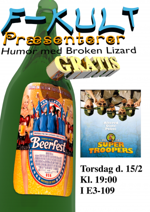
First Blender-made F-kult poster. Note that the bottle is present in all subsequent 3D posters, although sometimes better hidden than others. Both the mesh and material of the bottle itself remains largely unchanged. By the last poster for this semester, the bottle was upgraded to feature Limfjordsporter labels.
29/2
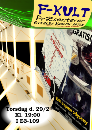
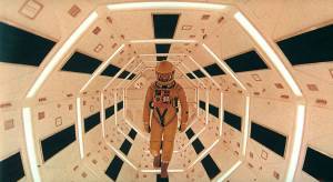
To the right is shown the reference image for this poster. The seemingly realistic light for the lamps in the poster, was created by cheating. When creating a lamp in a virtual 3D environment, you will not usually be able to see the lamp itself, as it's just treated as a light source. Each lamp in the poster is actually two area lamps, one pointing into the environment, the other pointing at the wall, creating the illusion of lamps embedded in the walls.
15/3
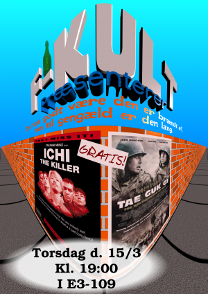
The rather odd „panorama/fish-eye“ perspective in this poster is achieved by a rendering trick, and not by adjusting camera attributes. Blender has an option to render an image by splitting it into a number of columns, and then turning the camera a bit for each column.
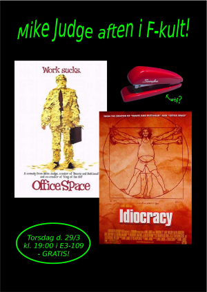
29/3
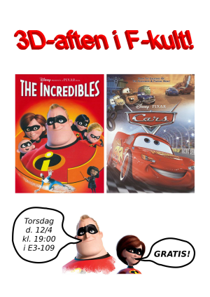
12/4
26/4
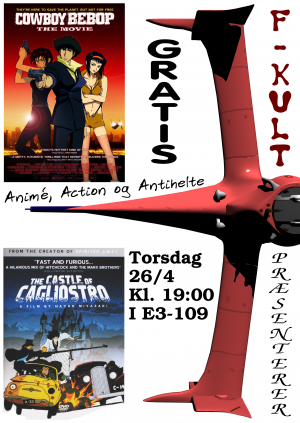
This model is cool. It was, however, done before I was aware that there was such a thing as „weights“ on the edges of a subsurfaced model. This means that the mesh was made a bit more elaborately than actually necessary. One learns from experience.
If you open the Blender file, you will also note that the Swordfish II is missing its engine…
10/5
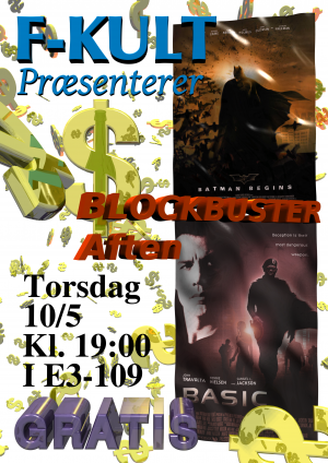
Random copy-scripting! Wheee!
Also, the flappy-looking posters were not done using bumpmapping, but displacement mapping.
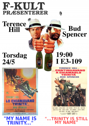
24/5
The coolest poster of them all for this semester. A question might be nagging you if you open the Blender file, and realize that Terence, Bud, the bottles and the caps were not in fact, pasted together with The Gimp. This question might be: „Why not?“. The answer to that question is simple: „Because Not“.
Also. The bottle was upgraded to become a Limfjordsporter!
